Design Resource
History of Devanagari Letterforms
Evolutionary of Devnagri Typeface
by
The National Institute of Design, India is developing type forms to facilitate mechanism and photographic reproduction in the major Indian languages. Today, Typefaces in most Indian scripts are same as those which are in existence when printing first commenced in India.
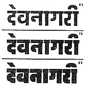
Traditional type designs are derived from forms created with a reed pen as in the case of Devanagari, Gujarati, Bengali etc. Variations in the size, width, and weight of individual typefaces are required for a variety of applications in newspapers, books, hoardings, press advertising, exhibitions, street signage and so forth. Yet the letterforms are restricted about three variations (normal, bold, italic). Hence even at a glance at any street hoarding or newspaper one can find sizes, quantity and variety in letterforms. Therefore, there is an urgent need to develop a more functional approach to the development of letterforms, suiting them to Indian needs.
At NID, this design experiment is being conducted in Devanagari, Bengali, Tamil and other scripts. This experiment commenced in 1967 when Adrian Frutiger (designer of Univers Type Series) was invited by NID to start the type design activity at the Institute. The following work demonstrates the simplicity, order and standardization which have been made possible in the mode and basic construction of each letterform. The style allows for variation in width and weights. It facilitates typecasting as well as photo composing. The composition of these forms provides suitable grey areas that assist the legibility of individual letters even when reduced to a small type size.
The simplicity of forms and the structure of the new design are done keeping in mind the requirements of latest technology. This is an imminent need as India enters the new world.


