Design Gallery
Graphically Interesting Logos of India
Logos of India
by
-

Amul Milk
Designer: YeshwantChaudhary, Communica Corporate Communications
This logo was designed for Gujarat Co-operative Milk Marketing Federation Ltd. (GCMMF) in late 40s. The philosophy behing the brand name ‘Amul’ meaning ‘Amoolya’ (‘pure’ in Sanskrit) has been directly represented in the graphic treatment of the word ‘Milk’ as an image reminding of cow’s udders for extracting milk in purest form. The connection creates a mark of quality associated with “Amul Milk’. The logo was used on the packaging and other collaterals distributed and managed by GCMMF then. -

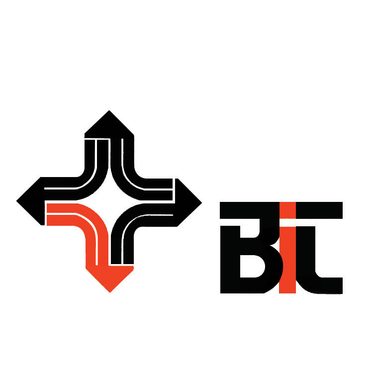
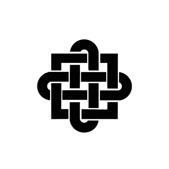
Bureau of International Transportations
Designer: Yeshwant Chaudhary, Communica
The logo for Bureau of International Transportations represents BTS’ identity of being a global transportation network, that helps churn knowledge-based decisions for easy flow of goods. The ponting arrow forms if the rhombus used for the logo connotes this efficient flow of goods etc. to trade and transportation professionals, government bodies etc. The lines inside the strokes of the rhombus depict continuous generation of data produced and transmitted by BTS. -

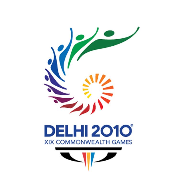
Common Wealth Games 2010
Design Firm: Idiom design and Consulting
The logo for Common Wealth Games 2010 celebrates the spirit of participation, contribution, competition and persuasion towards sports over the platform of Common Wealth Games, a multi-sport international events involving participation of atheletes from Common Wealth Nations (the first Common Wealth Games goes back to 1930). The metamorphosis of bright yellow and orange rays into joyous human figures, escalating high in the spirit of celebrating international sports spirit and development creates an attractive rhythm, full of positivity, vigour and a forward-looking determination to share the joy of participation and union of different vibrant cultures signified by use of multi-colour metamorphosed progression in the logo. -

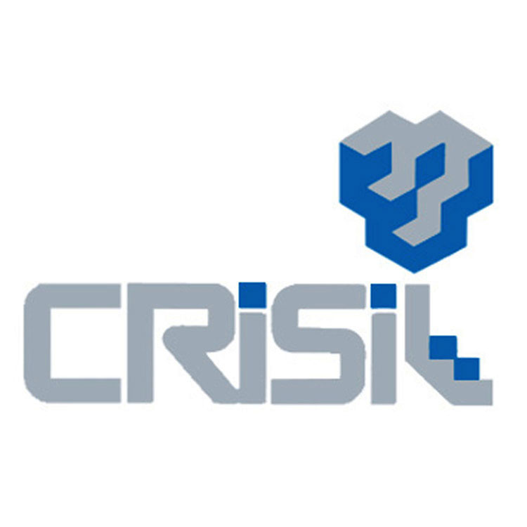
Crisil India Limited
Designer: ViruHiramath
Founded in 1987, Crisil India Limited is a research based global analytical company, providing risk and policy free advisory services. The services help keep markets stable and more functional. The deep research about investment scene in India, good investment ideas etc. makes Crisil a credible and developing body that helps shape up public policies of finance and investments. The shape of a step by step building cubic structure signifies Crisil’s aims and role in global market. The colours used to create an upward staircase illusion in the logo and name exude the matured image and consistent performance of the global company. -

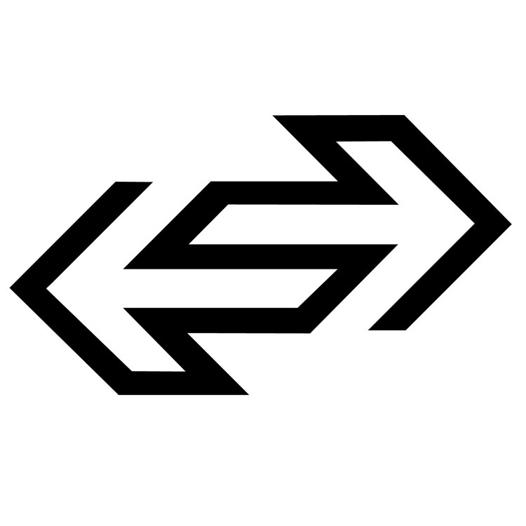
Delhi Transport Corporation (DTC)
Designer: BenoySarkar, NID
Incorporated by government in 1948, as the local bus service that operates interstate services in six states of Punjab, Haryana, Rajasthan, Jammu & Kashmir, Uttar Pradesh and Uttarakhand. The logo presenting the inter-connecting arrows facing each other signify the inter-sate local bus services. The overlap and use of mirror images creates an interesting and unique form to show interconnected transport between states. The simple and open juxtaposition of arrows also connotes efficiency in terms of speed, quality service, continuous services etc. -

Expo Marketing Logo
Designer: Prof. R.K. Joshi -

ICC World Cup 2011
Designer: Australian logo design firm called ‘Witekite’
The theme of ICC World Cup 2011 was ‘Celebration with Cricket’. This was closely kept in mind while using the shapes of human figures, the colourful gradient and other elements to create a feel of vibrancy of the celebration concept. This colourful ball with human figures in action, cheering and shouting for their teams, forming the rich texture of the spherical shape of the ball exude the energy, fervor and the spirit of high involvement in cricket. The rhythmic color and form movement of the ball creates an attractive festivity and mood for the players and fans alike. -

Indian Rayon Industries Pvt Ltd.
Designer: Viru Hiramath
Designed in late 1950s, the logo of Indian Rayon (renamed Indian Rayon and Industries Limited in 1987) represents the processing of the viscose filament yarn unit symbolically. The parallel lines forming the triangular cycle represents the precision and engineering of Rayon fibers. The precision depicts the quality of Rayon produced and exported. The triad form also depicts a continuous process of producing Rayon and expanding its presence around the world. -

Trikaya Grey Advertising
Designer: Viru Hiramath
The logo represents the flexibility, structural strength and quality of products available at Fusion Polymers Limited. Be it cables, Co-Axial cables, Networking cables, Thermocouple wire, control cables and other accessories etc, the three dimensional logo form amplifies the high quality engineering and precision of its products. -

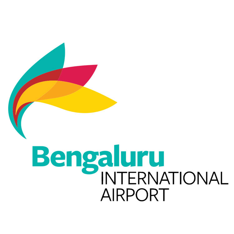
Bengaluru Airport
Designer: Ray+Keshavan, Bengaluru
Bengaluru’s image as World’s Silicon Valley, experienced a temporary jolt around 2009. Taking inspiration from the scenario, the logo for the new Bengaluru Airport was designed with a new and a fresh form. The form is visually inspired from the dazzling city avenues and the mesmerizing flora of the city. This true spirit of the city has been alive since the time of 1920s. The idea is to entice the minds of the people with the multi-coloured form as they walk through the airport. The blooming form and the use of a colour palette inspired from primaries makes the logo visually dynamic and distinct. -

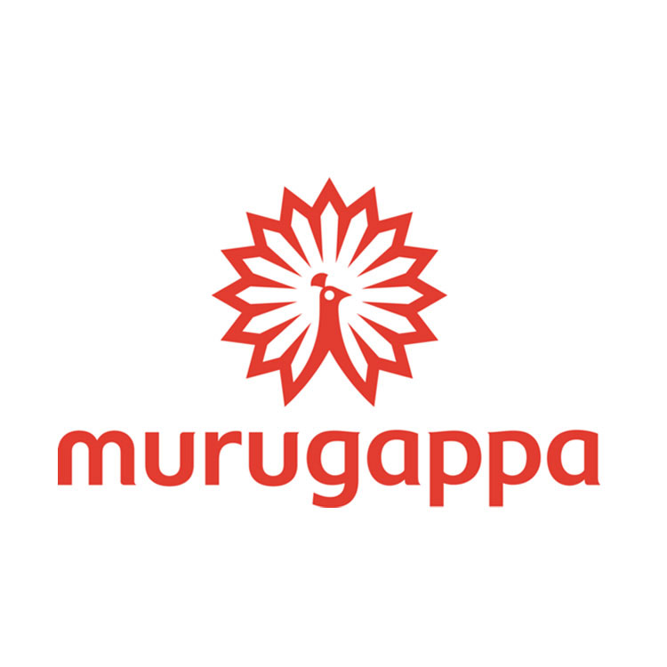
Murugappa Group
Designer: Lopez Design, New Delhi
The group unveiled its new logo in 2010. A contemporary visual treatment has been given to the peacock form used as a symbol for the company. It signifies in red colour a continuing passion, vigour, power, drive, energy. The lowercase style for the name goes with the trend of the times. Lowercase provides downward balance to the composition, with the symbol at the top with more heavy and dense form. The idea being to represent the traditions of the group in modern times. Therefore, the soft curves in the lowercase letters have been inspired by the curves of Dravidian letterforms. -

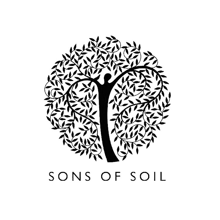
SONS of SOIL
Designer: The Flagship Advertising
SONS of SOIL is a group of people who are passionately work and offer exquisite landscaping solutions and nurseries. The efforts are to preserve and restore nature in its raw form. The logo is a mirror of what Sons of Soil stand for. The design cue is an inspiration from the universal “Tree of Life” concept. The tree trunk is a man holding nature in its true form – vital, evolving and ever-green. His arms or the tree branches with their rhythmic swirls pays tribute to the beauty of nature and its resources. The logo envisages an Indianness and a Universal Appeal via its form.


Graphic Design has a special quality to influence the general public with distinct alterations given to shapes and forms. Designers generally use positive negative spaces, color combinations, rhythm, repetitions, patterns, continuation etc. to create a unique impact on viewers. Forms have a strong compelling power. This power gets amplified with the use of unusual effects and graphic treatments given to these forms. The result generally provides a unique identity for a company/ organization. This identity not only presents information through a company’s name, but also creates a mood and emotive quality within the logo that leaves an eternal imprint of the image in the viewers’ mind.
For more details:
http://www.dsource.in/resource/logos-india

Amul Milk
Designer: YeshwantChaudhary, Communica Corporate Communications
This logo was designed for Gujarat Co-operative Milk Marketing Federation Ltd. (GCMMF) in late 40s. The philosophy behing the brand name ‘Amul’ meaning ‘Amoolya’ (‘pure’ in Sanskrit) has been directly represented in the graphic treatment of the word ‘Milk’ as an image reminding of cow’s udders for extracting milk in purest form. The connection creates a mark of quality associated with “Amul Milk’. The logo was used on the packaging and other collaterals distributed and managed by GCMMF then.
Bureau of International Transportations
Designer: Yeshwant Chaudhary, Communica
The logo for Bureau of International Transportations represents BTS’ identity of being a global transportation network, that helps churn knowledge-based decisions for easy flow of goods. The ponting arrow forms if the rhombus used for the logo connotes this efficient flow of goods etc. to trade and transportation professionals, government bodies etc. The lines inside the strokes of the rhombus depict continuous generation of data produced and transmitted by BTS.
Common Wealth Games 2010
Design Firm: Idiom design and Consulting
The logo for Common Wealth Games 2010 celebrates the spirit of participation, contribution, competition and persuasion towards sports over the platform of Common Wealth Games, a multi-sport international events involving participation of atheletes from Common Wealth Nations (the first Common Wealth Games goes back to 1930). The metamorphosis of bright yellow and orange rays into joyous human figures, escalating high in the spirit of celebrating international sports spirit and development creates an attractive rhythm, full of positivity, vigour and a forward-looking determination to share the joy of participation and union of different vibrant cultures signified by use of multi-colour metamorphosed progression in the logo.
Crisil India Limited
Designer: ViruHiramath
Founded in 1987, Crisil India Limited is a research based global analytical company, providing risk and policy free advisory services. The services help keep markets stable and more functional. The deep research about investment scene in India, good investment ideas etc. makes Crisil a credible and developing body that helps shape up public policies of finance and investments. The shape of a step by step building cubic structure signifies Crisil’s aims and role in global market. The colours used to create an upward staircase illusion in the logo and name exude the matured image and consistent performance of the global company.
Delhi Transport Corporation (DTC)
Designer: BenoySarkar, NID
Incorporated by government in 1948, as the local bus service that operates interstate services in six states of Punjab, Haryana, Rajasthan, Jammu & Kashmir, Uttar Pradesh and Uttarakhand. The logo presenting the inter-connecting arrows facing each other signify the inter-sate local bus services. The overlap and use of mirror images creates an interesting and unique form to show interconnected transport between states. The simple and open juxtaposition of arrows also connotes efficiency in terms of speed, quality service, continuous services etc.
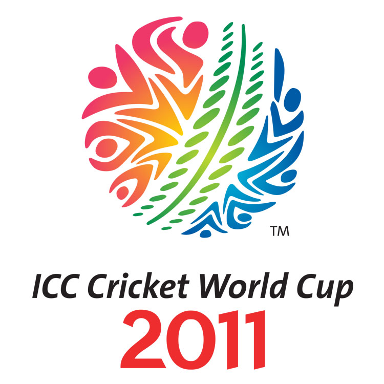
ICC World Cup 2011
Designer: Australian logo design firm called ‘Witekite’
The theme of ICC World Cup 2011 was ‘Celebration with Cricket’. This was closely kept in mind while using the shapes of human figures, the colourful gradient and other elements to create a feel of vibrancy of the celebration concept. This colourful ball with human figures in action, cheering and shouting for their teams, forming the rich texture of the spherical shape of the ball exude the energy, fervor and the spirit of high involvement in cricket. The rhythmic color and form movement of the ball creates an attractive festivity and mood for the players and fans alike.
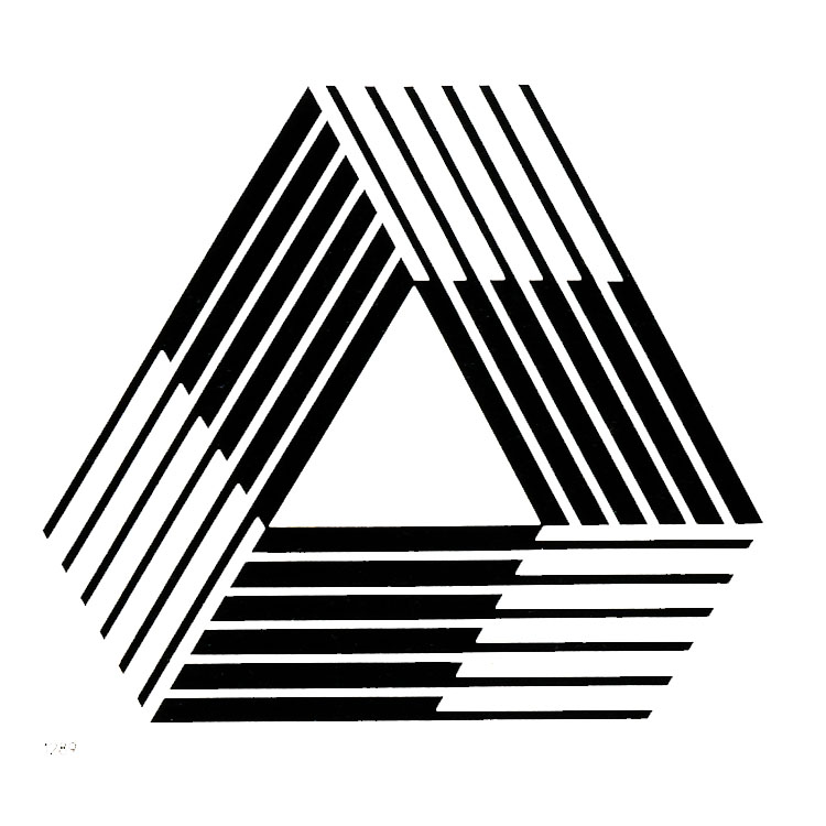
Indian Rayon Industries Pvt Ltd.
Designer: Viru Hiramath
Designed in late 1950s, the logo of Indian Rayon (renamed Indian Rayon and Industries Limited in 1987) represents the processing of the viscose filament yarn unit symbolically. The parallel lines forming the triangular cycle represents the precision and engineering of Rayon fibers. The precision depicts the quality of Rayon produced and exported. The triad form also depicts a continuous process of producing Rayon and expanding its presence around the world.
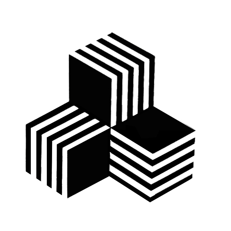
Trikaya Grey Advertising
Designer: Viru Hiramath
The logo represents the flexibility, structural strength and quality of products available at Fusion Polymers Limited. Be it cables, Co-Axial cables, Networking cables, Thermocouple wire, control cables and other accessories etc, the three dimensional logo form amplifies the high quality engineering and precision of its products.
Bengaluru Airport
Designer: Ray+Keshavan, Bengaluru
Bengaluru’s image as World’s Silicon Valley, experienced a temporary jolt around 2009. Taking inspiration from the scenario, the logo for the new Bengaluru Airport was designed with a new and a fresh form. The form is visually inspired from the dazzling city avenues and the mesmerizing flora of the city. This true spirit of the city has been alive since the time of 1920s. The idea is to entice the minds of the people with the multi-coloured form as they walk through the airport. The blooming form and the use of a colour palette inspired from primaries makes the logo visually dynamic and distinct.
Murugappa Group
Designer: Lopez Design, New Delhi
The group unveiled its new logo in 2010. A contemporary visual treatment has been given to the peacock form used as a symbol for the company. It signifies in red colour a continuing passion, vigour, power, drive, energy. The lowercase style for the name goes with the trend of the times. Lowercase provides downward balance to the composition, with the symbol at the top with more heavy and dense form. The idea being to represent the traditions of the group in modern times. Therefore, the soft curves in the lowercase letters have been inspired by the curves of Dravidian letterforms.
SONS of SOIL
Designer: The Flagship Advertising
SONS of SOIL is a group of people who are passionately work and offer exquisite landscaping solutions and nurseries. The efforts are to preserve and restore nature in its raw form. The logo is a mirror of what Sons of Soil stand for. The design cue is an inspiration from the universal “Tree of Life” concept. The tree trunk is a man holding nature in its true form – vital, evolving and ever-green. His arms or the tree branches with their rhythmic swirls pays tribute to the beauty of nature and its resources. The logo envisages an Indianness and a Universal Appeal via its form.