Design Case study
Mother and Child Protection Card
Redesigning of Immunization Card
by
Designing the 'header'
Our prototype evolved in response to the insights obtained from need-finding exercises. Ours is a Vaccination only chart [1]. It consists of mother’s and baby’s demographic information and a vaccine schedule. Later growth charts were added too.
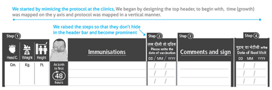
Redesign of the immunization card began with arranging and rearranging data. The header has been organized into a 4 step action-oriented wizard such that all the necessary steps are followed and no detail is missed. These four steps mimic the sequence of actions at an immunization centre / PHC in India.
• Step 1: Measuring and recording weight, height and head circumference of the child. Read about the vaccinations due and vaccinate the child.
• Step 2: Write date of immunization
• Step 3: Write comments if any and sign
• Step 4: Write date of next visit.
We came across a more or less standard immunization protocol at four types of clinics we studied. We arranged fields of the immunization schedule into a 4 step wizard around that protocol.
Single colour printing vs. Use of colour:
To keep printing costs low or in case of photocopies being used when the printed forms don’t get supplied; we designed our form in black / white.
During contextual inquiry it was found that when columns of date of vaccination and date of next visit fell right next to each other and are not visually very distinct it created trouble for person entering as well as retrieving data from these columns. Thus it was clear that the two date columns have to be separated somehow.
Thus, dates of immunization and next immunization are -
• Separated by distance,
• Differentiated by colour coding and change of heading.
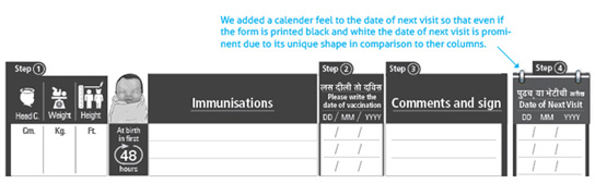
The heading- date of next immunization has been changed to ‘Date of Next Visit’.
A visual calendar element has been added to reinforce the message –
‘Here’s an important date to be remembered’
Moreover,
The date of immunization should be entered by health worker/ PHC staff only after vaccinating the child and hence it is positioned on the right of ‘list of vaccines’ column and before comments’ column.
We wanted to be sure that we don’t interrupt the nurse’s flow of writing and hence date of next visit was brought to extreme right as that is the last entry she makes before the card is handed back to the parents. However from parents’ point of view this is priority number one. How to manage when the top priorities are different for different stakeholders? It is a delicate balance.
Colours can be used
to subtly communicate hierarchy of information. Red colour gives date of next visit column visual importance, while it is the first to be seen when one looks at the immunization schedule. But date of immunization is critical too, for healthcare providers and it in hierarchy of information it comes second, hence it was coded blue. To create a visual marker for age of the baby, we added illustration of a new born baby.
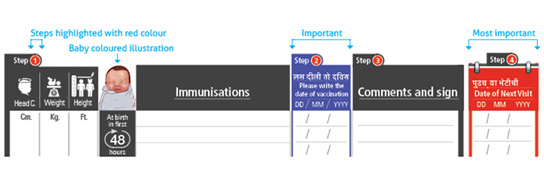
In order to achieve priority number 1 for parents, we separated the column and highlighted it by making it red. Also notice that the left chunk of the header i.e. steps 1 to 3 is meant for healthcare providers while the column on right i.e. step 4 is meant for parents (although healthcare providers populate it).
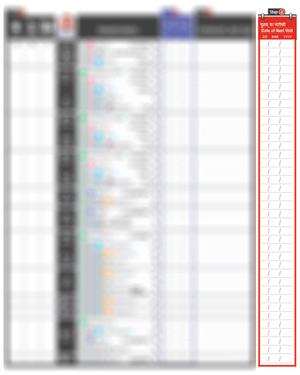
If all the vaccines in a given session are administered, a bracket can be drawn and acommon date can be written under ‘date of vaccination’ column.To solve the problem of cancellation or revision of date incase immunization is postponed; we designed the date of next visit column to flow continuously. Thus, it accommodates errors, in case one has to scratch out a date and write again.
However if one vaccine - say Hep B in the 6th week is postponed, the date slot for that vaccine should be left empty and be filled only after that vaccine is given in subsequent visits.
Ref. [1] - Home-based child vaccination records - A reflection on form by David W. Brown, Marta Gacic-Dobo, Stacy L. Young.