D'Source
Published on D'Source (http://www.dsource.idc.iitb.ac.in)

Home > Print > Case Study > V Channel Spot Brand > Design Process > Design Process


A Flexible Identity:
The name was a (not so) subtle play of words to create an image of a format that is part café, part lounge and part hangout space for Channel [v]’s target audience. The identity was designed to be flexible and to be as flexible as the channel [v] logo.


A New Format: Sit Back, Chill out, Hangout!
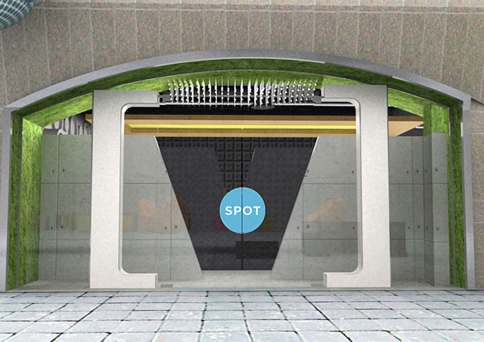
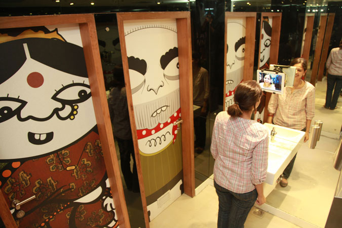
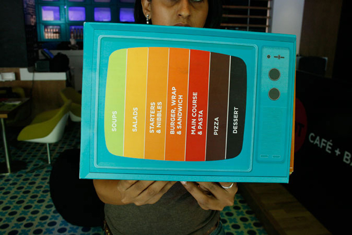
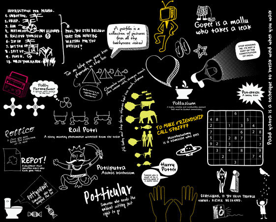
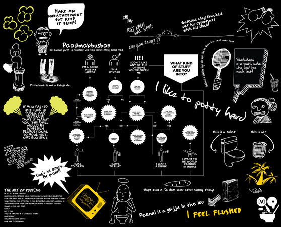
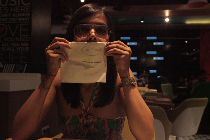
The [v] SPOT created an entirely new F&B format. Blending the characteristics of a café, bar, lounge and literally a television set- its the complete hangout space for todays youth. They connect with the Channel [v] brand, hangout with their friends, play games, experiment with food and much more.

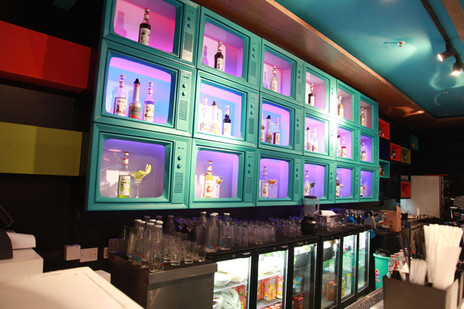
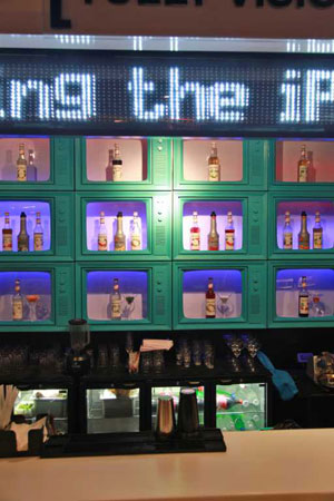
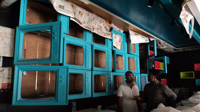
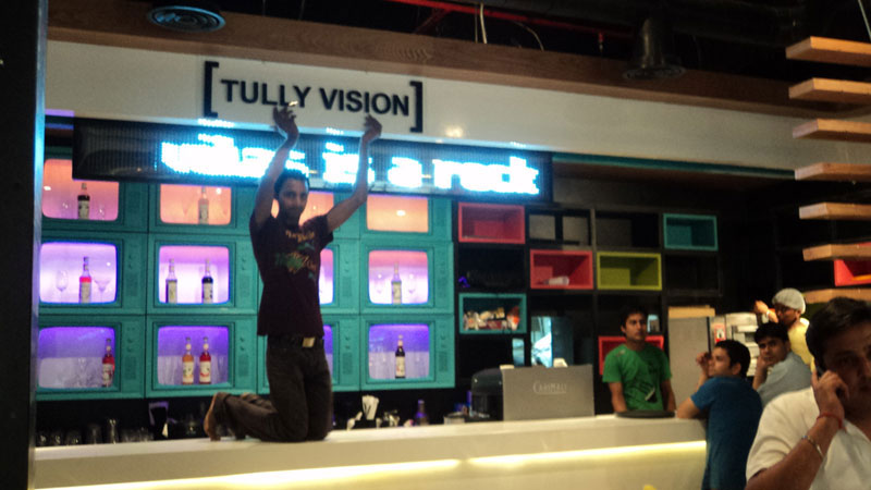
This created the basis for the space design where the central feature was the bar but designed in a way that didn’t take itself too seriously. (The bar features a retro TV wall - and is aptly named 'Tully Vision').

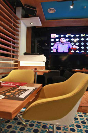
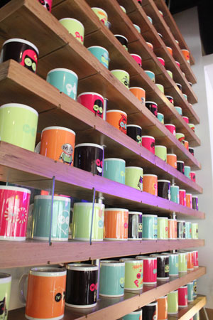
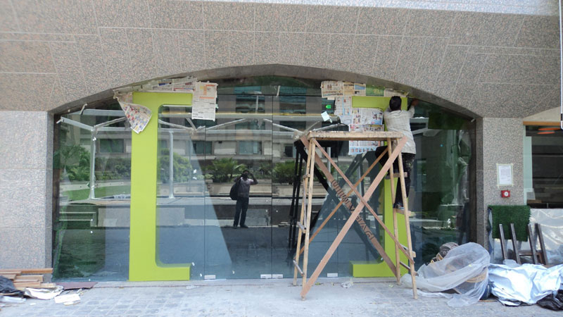
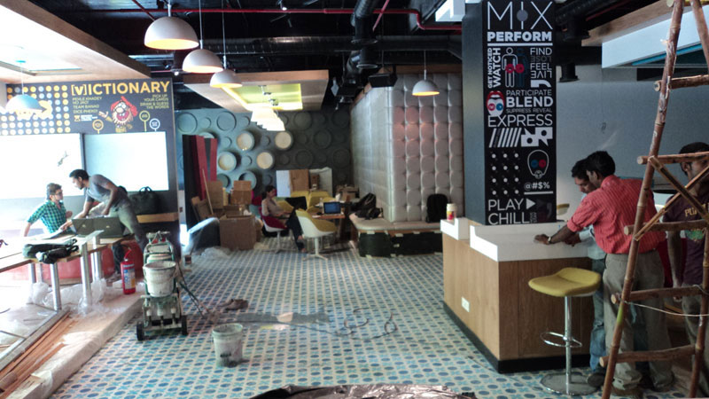
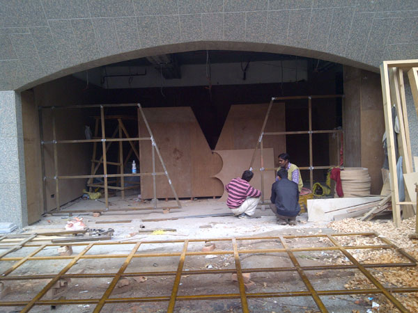
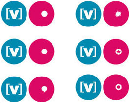
The seating and space layout was designed not just for dining but also for live events, games and for people to just...hangout. The entrance was designed as a giant [v] logo - which served as a literal interpretation of the [v] SPOT experience. A wall feature was designed which featured the various avataars of the channel [v] logo. Another key feature was a giant video wall which runs Channel [v] and [v] SPOT content throughout the day. A screen made out of the many renditions of the [v] SPOT logo printed on coffee mugs created another key feature of the space. A giant changeable mural wall adds to the graphic feature within the space.

All of these features were designed to be replicated in varying forms across multiple locations.

col-sm-12
col-sm-4
col-sm-8
col-sm-8
col-sm-4

‹ › ×


    Bloody Cool Technology:
    A key component of the [v] SPOT brand experience was the technology used that enhanced the experience. A video booth that lets you upload your videos to Channel [v], a ticker bar that lets you display messages from your phone, an iPad app for the menu - these were some of the key tech features of the [v] SPOT.

    col-sm-8
    col-sm-4

    ‹ › ×


      Designing an Experience:
      The [v] SPOT experience was extended across every level of the customer touch point. From the menu design to the way the bills were given, from the uniforms to the placemats - every aspect of the experience was carefully and cheekily designed. The end result was an integrated experience that connects the customer to the brand.

      col-sm-3
      col-sm-3
      col-sm-3
      col-sm-3
      col-sm-12

      ‹ › ×


        Puns Galore!
        Another integral part of the brand is the humor. Puns were used liberally and every opportunity to engage the customer was taken as an opportunity to poke fun at someone! Shown below are some of the cocktail names and the bathroom graffiti.

        col-sm-4
        col-sm-4
        col-sm-4

        ‹ › ×


          We did it together!
          The project was a truly collaborative project - with the core team comprising of Channel [v], Technopak, Master Franchisee and Idea Spice. It was a truly enriching experience for us and a gigantic learning curve.

          col-sm-4
          col-sm-4
          col-sm-4
          col-sm-4
          col-sm-4
          col-sm-4
          col-sm-6
          col-sm-6

          ‹ › ×


            Powered by Drupal

            Source URL:http://www.dsource.idc.iitb.ac.in/case-study/v-channel-spot-brand/design-process