Jump to navigation

  •  
  •  
  •  

  • Courses
  • Resources
  • Case study
  • Showcase
  • Tools
  • Gallery
  • Videos

Search form

Animation Design Communication Design Design Fundamentals Interaction Design Product Design Tools for Design Open Design
Home / Gallery / Old Shop Signs

.

top unblocked 76 games free access unblocked games 76 now latest unblocked online games kays games unblocked access retro bowl unlimited play play retro bowl without block cool math brain games free school-friendly unblocked games yohoho io game online lesson guru hack and help play baseball bros unblocked classroom 6x games to play 76
Design Gallery

Old Shop Signs

Old Shop Signs - Abdul Rehman Street, Mumbai
by
Nanki Nath, Ph D student
IDC, IIT Bombay
  • Printer-friendly version
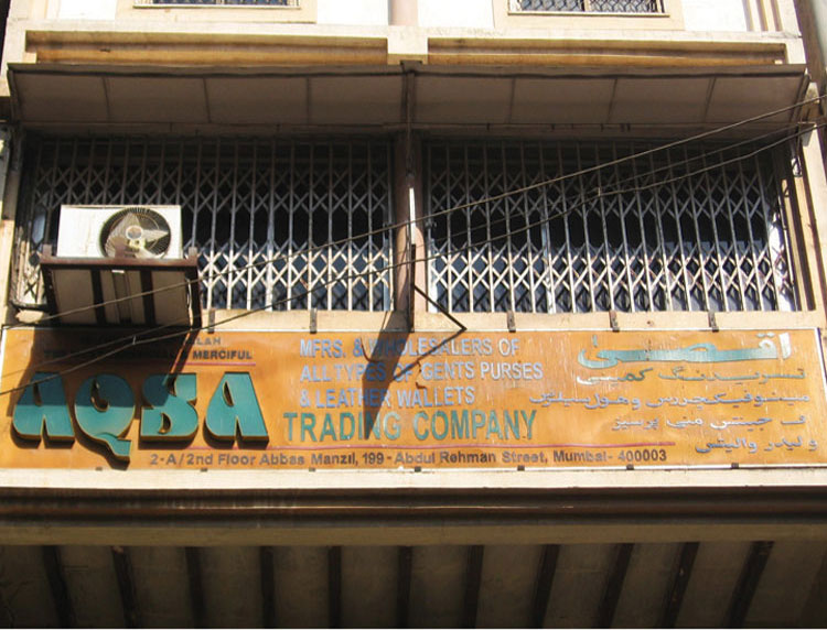
  • The three dimensional typographic style of AQSA presents a retro visual identity. Green text against a faded orange background makes the board a curious example of experimental sign design.

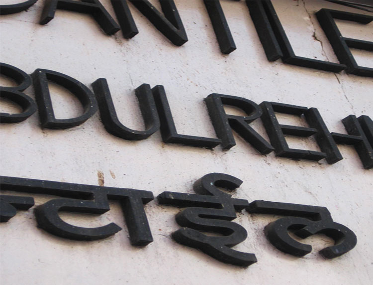
  • The sign displays the name of bank in cut and pasted wooden letters. The stroke width of English geometric letters closely matches those of Hindi letters.

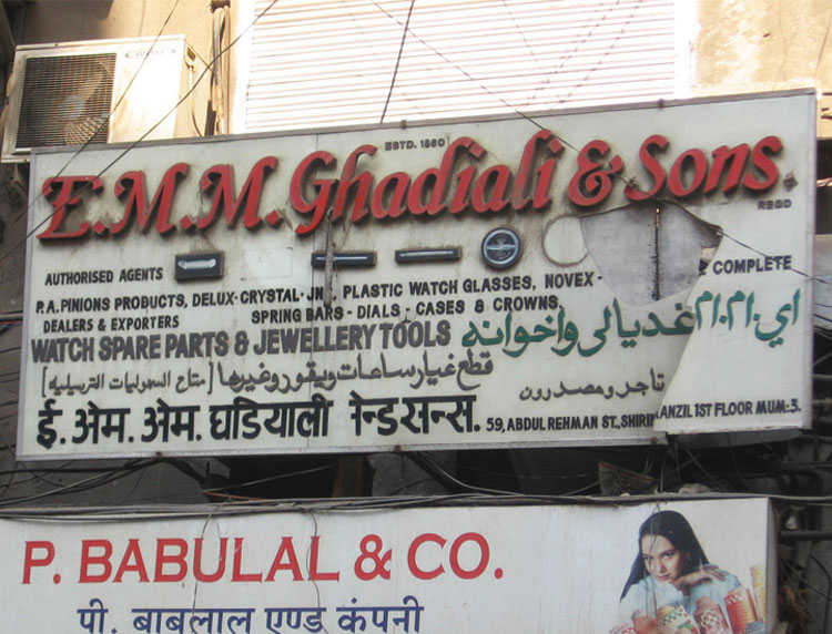
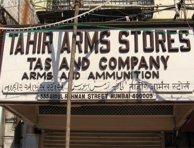
  • An old shop using Arabic script along with Hindi and English names of the shop creating a multilingual identity.

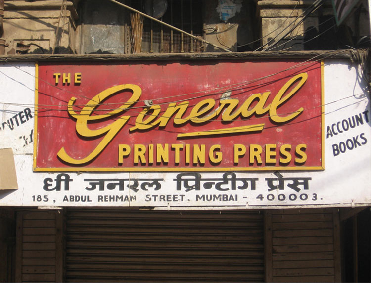
  • Signature style name acts as a direct persuasive mark for the shop. The use of yellow text on red background makes it fantastic and visible from distance.

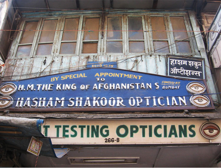
  • This oldest sign in the street uses iconic image of eye that is an easy comprehension for semi-literate and illiterate viewers.

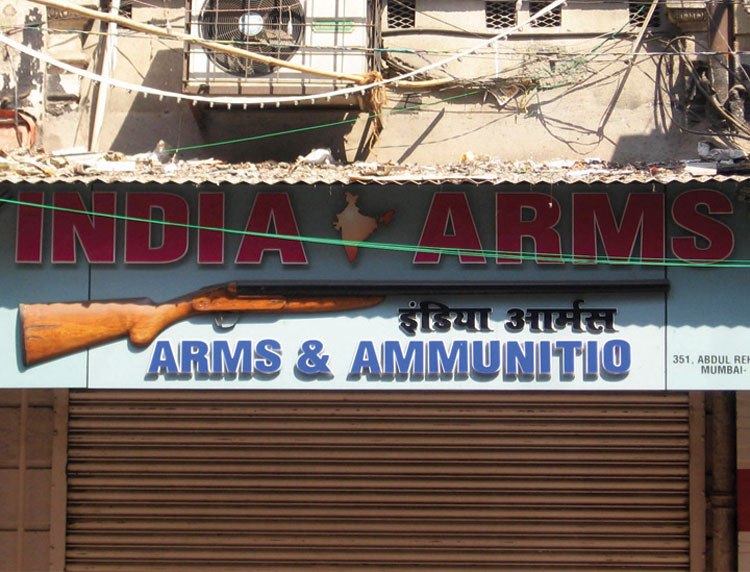
  • The symbol for the shop identity is a three-dimensionally constructed riffle on the signboard. The image of map of India envisages the concept further.

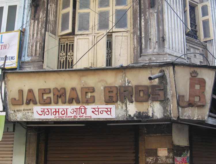
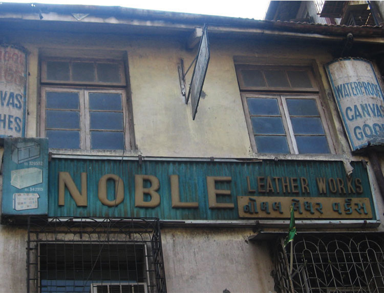
  • The letters are big, bold and geometric forms with a  rustic look, making it a typical old crafted identity.

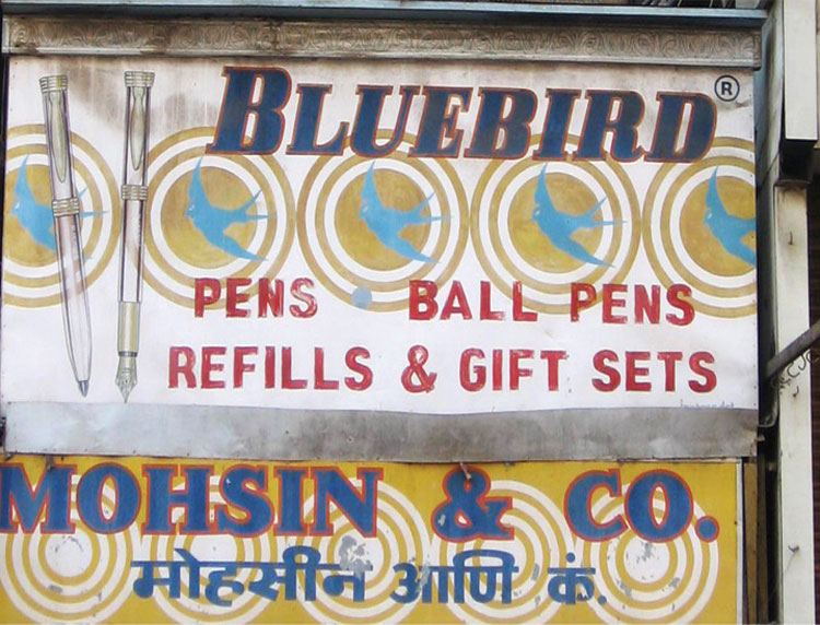
  • One tends to associate the free flow of flying birds with the apparent quality of the pens and stationary that would be available at the shop.

  • There is an interesting hierarchy present due to additional signboards. This makes the main signboard look like a newspaper masthead.

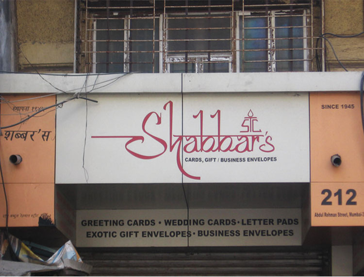
  • The calligraphic expression of shop name enhances the visual appeal of the signboard. Artistic treatment of letters makes the identity poetic.

  • The unique feature of the sign is the use of four languages displayed very intelligently on the board in different typesizes.

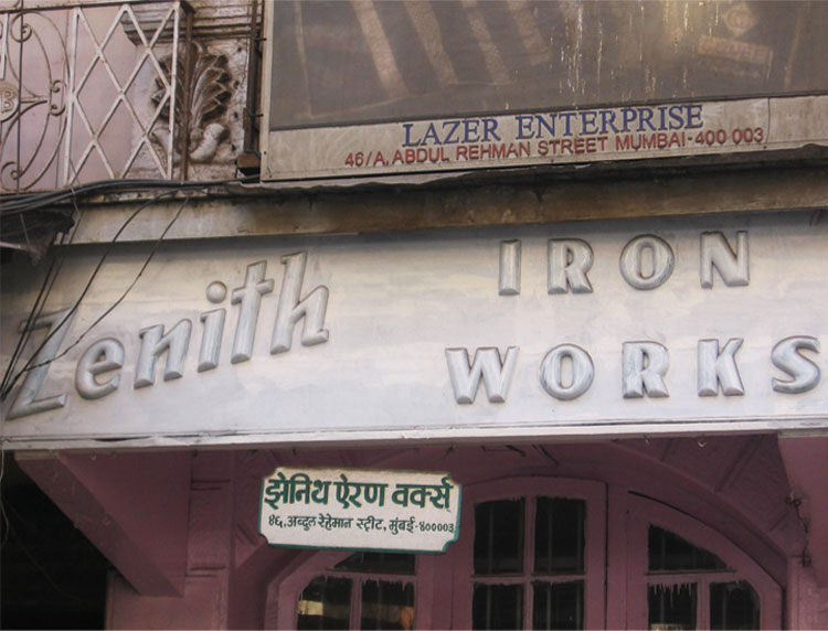
  • The silver painted board and the orientation of text Zenith makes the board unique compared to other similar shops in the street.

The three dimensional typographic style of AQSA presents a retro visual identity. Green text against a faded orange background makes the board a curious example of experimental sign design.

The sign displays the name of bank in cut and pasted wooden letters. The stroke width of English geometric letters closely matches those of Hindi letters.

An old shop using Arabic script along with Hindi and English names of the shop creating a multilingual identity.

Signature style name acts as a direct persuasive mark for the shop. The use of yellow text on red background makes it fantastic and visible from distance.

This oldest sign in the street uses iconic image of eye that is an easy comprehension for semi-literate and illiterate viewers.

The symbol for the shop identity is a three-dimensionally constructed riffle on the signboard. The image of map of India envisages the concept further.

The letters are big, bold and geometric forms with a  rustic look, making it a typical old crafted identity.

One tends to associate the free flow of flying birds with the apparent quality of the pens and stationary that would be available at the shop.

There is an interesting hierarchy present due to additional signboards. This makes the main signboard look like a newspaper masthead.

The calligraphic expression of shop name enhances the visual appeal of the signboard. Artistic treatment of letters makes the identity poetic.

The unique feature of the sign is the use of four languages displayed very intelligently on the board in different typesizes.

The silver painted board and the orientation of text Zenith makes the board unique compared to other similar shops in the street.

Abdul Rehman Street is one of the oldest and historically significant streets of South Mumbai. Popularly known as a wholesalers mecca in South Mumbai, the street envisages a great variety of wholesale products, local culture, flavours and colours. The street consists of buildings and shops since late 19th century till early 21st century. Shop signs here present changes in the kind of information display, graphic representations and use of novel materials to create panel forms, expressive backgrounds, three-dimensional lettering, three-dimensional metaphoric forms.
 

The three dimensional typographic style of AQSA presents a retro visual identity. Green text against a faded orange background makes the board a curious example of experimental sign design.

The sign displays the name of bank in cut and pasted wooden letters. The stroke width of English geometric letters closely matches those of Hindi letters.

An old shop using Arabic script along with Hindi and English names of the shop creating a multilingual identity.

Signature style name acts as a direct persuasive mark for the shop. The use of yellow text on red background makes it fantastic and visible from distance.

This oldest sign in the street uses iconic image of eye that is an easy comprehension for semi-literate and illiterate viewers.

The symbol for the shop identity is a three-dimensionally constructed riffle on the signboard. The image of map of India envisages the concept further.

The letters are big, bold and geometric forms with a  rustic look, making it a typical old crafted identity.

One tends to associate the free flow of flying birds with the apparent quality of the pens and stationary that would be available at the shop.

There is an interesting hierarchy present due to additional signboards. This makes the main signboard look like a newspaper masthead.

The calligraphic expression of shop name enhances the visual appeal of the signboard. Artistic treatment of letters makes the identity poetic.

The unique feature of the sign is the use of four languages displayed very intelligently on the board in different typesizes.

The silver painted board and the orientation of text Zenith makes the board unique compared to other similar shops in the street.


Creating Digital-learning Environment for Design


  • Courses
  • Resources
  • Case study
  • Showcase
  • Tools
  • Gallery
  • Videos
  • Animation Design
  • Communication Design
  • Design Fundamentals
  • Interaction Design
  • Product Design
  • Tools for Design
  • Open Design
  • Contribute to our Dsource
  • About
  • People
  • Events
  • Job@D'source
  • Contact Us
  • Privacy Policy
  • Download App
  • YouTube
  • Facebook
  • Twitter

Indian Language
English Bangali Gujarati Hindi
Kannada Malayalam Marathi Punjabi
Sindhi Tamil Telugu Urdu