Jump to navigation

  •  
  •  
  •  

  • Courses
  • Resources
  • Case study
  • Showcase
  • Tools
  • Gallery
  • Videos

Search form

Animation Design Communication Design Design Fundamentals Interaction Design Product Design Tools for Design Open Design
Home / Gallery / Fragrances Shop Signs

.

top unblocked 76 games free access unblocked games 76 now latest unblocked online games kays games unblocked access retro bowl unlimited play play retro bowl without block cool math brain games free school-friendly unblocked games yohoho io game online lesson guru hack and help play baseball bros unblocked classroom 6x games to play 76
Design Gallery

Fragrances Shop Signs

Fragrances Shop Signs - Mohammad Ali Road, Mumbai
by
Nanki Nath, Ph D student
IDC, IIT Bombay
  • Printer-friendly version
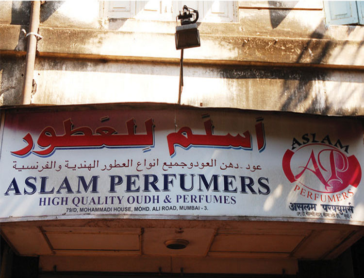
  • The big bold shop name in red, written in bold Urdu script catches eye. The style makes the otherwise modern display board visually enhanced.

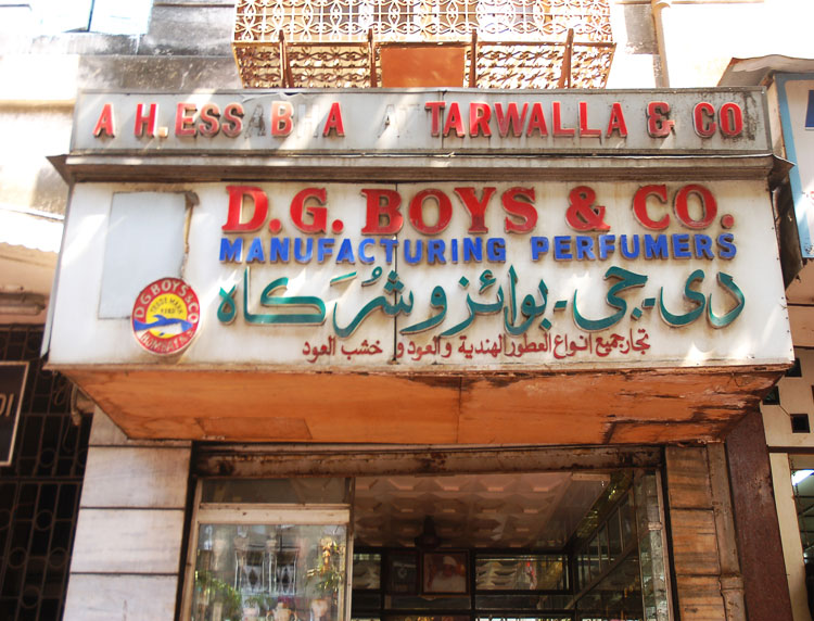
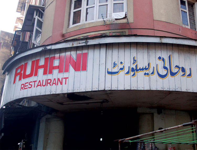
  • Red, blue and green colours used in sequence to depict the bilingual name in varying typesizes makes the board a specimen of intense visual activity and rhythm.

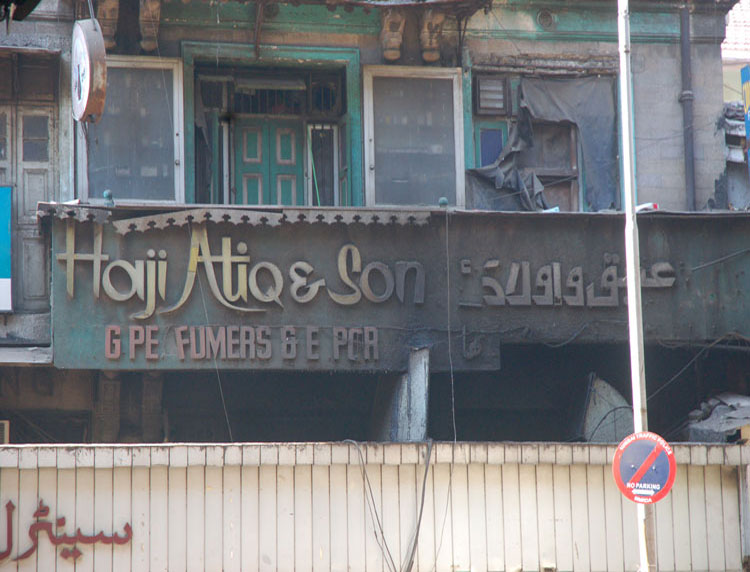
  • The burned, rusted sign displaying Urdu letters of the name as a retro graphic pattern makes the identity of the shop unique.

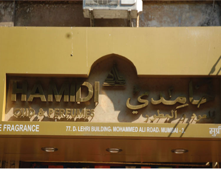
  • The symmetrical façade of a mosque with the dome structure framing the board adds a deep cultural context to the sign design.

  • Two variations of Urdu script displayed in the name of the shop, along with a modern typeface called Stencil creates an interesting fusion of traditional with modern concepts of design.

  • Image of Sheep reminds of weaves and woven products. The expression establishes the impression about the products of the shop instantly.

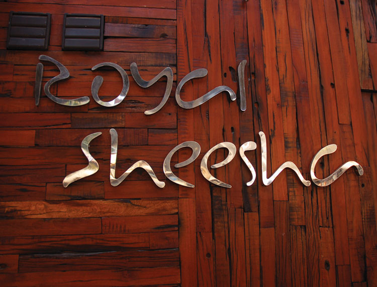
  • Letterforms with round, delicate terminals reminding of tear drops. The typographic expression has an oriental feel to it.

  • Use of typography as a graphic motif and the new panel form in wood makes the sign stand out amidst other restaurant signs.

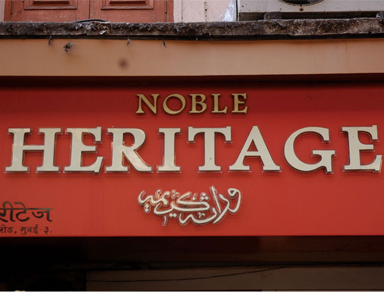
  • The centrally aligned text with Arabic translation arranged as an emblem makes the identity unique.

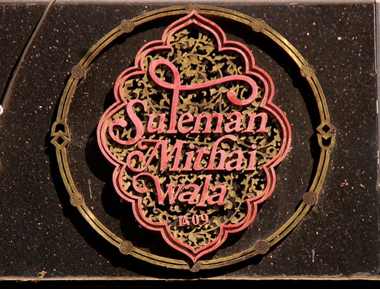
  • The typography reflects subtle influence from Urdu letterforms and their subtle variance within the Latin structure.

  • Identity displayed bilingually in Primary colours against a white background reminds of the old hand painted signs of early 20th century.

  • The special characteristic being the presence of an oriental identity with script acting as image of the shop, more than just serving the lingual function of giving information.

The big bold shop name in red, written in bold Urdu script catches eye. The style makes the otherwise modern display board visually enhanced.

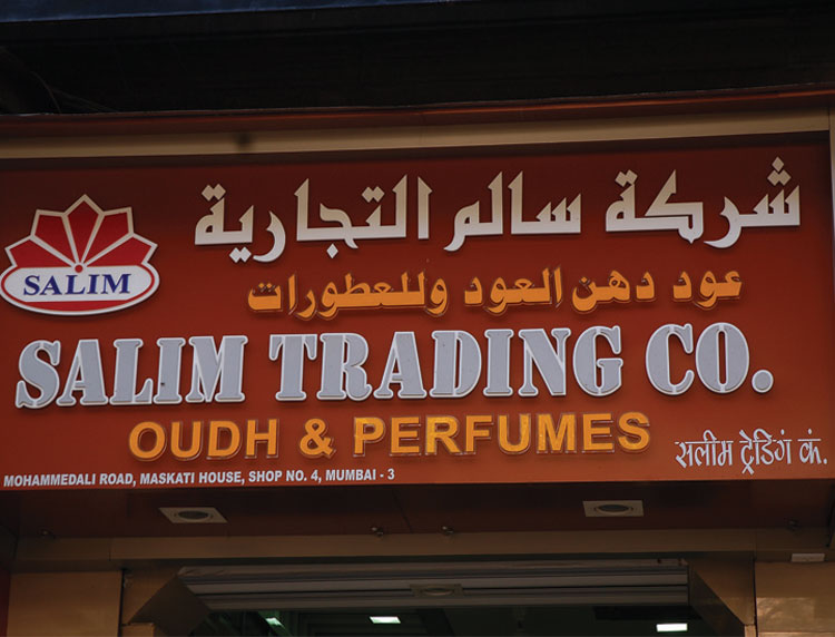
Red, blue and green colours used in sequence to depict the bilingual name in varying typesizes makes the board a specimen of intense visual activity and rhythm.

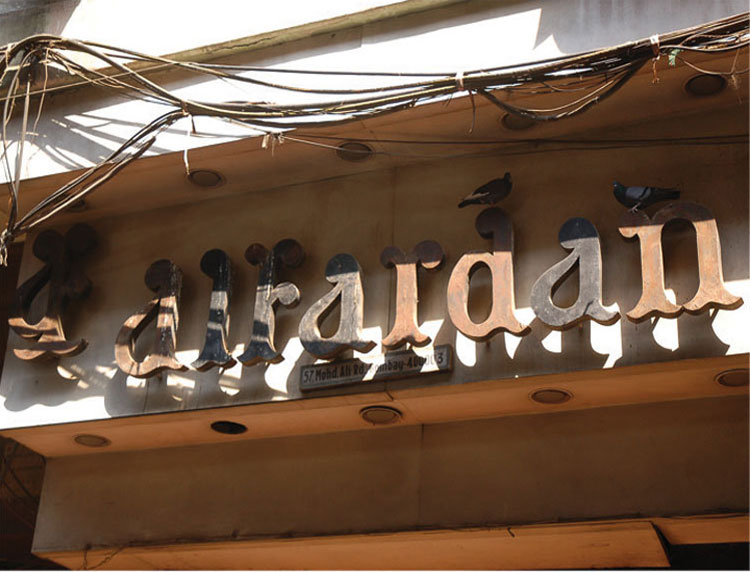
The burned, rusted sign displaying Urdu letters of the name as a retro graphic pattern makes the identity of the shop unique.

The symmetrical façade of a mosque with the dome structure framing the board adds a deep cultural context to the sign design.

Two variations of Urdu script displayed in the name of the shop, along with a modern typeface called Stencil creates an interesting fusion of traditional with modern concepts of design.

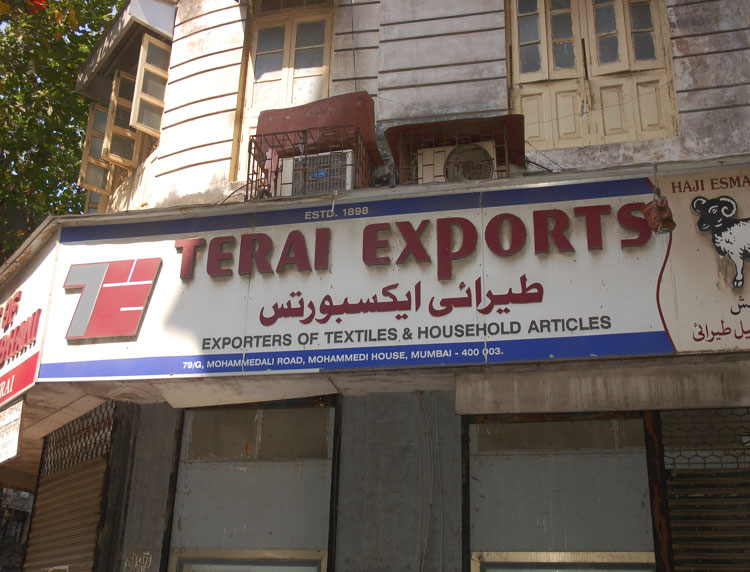
Image of Sheep reminds of weaves and woven products. The expression establishes the impression about the products of the shop instantly.

Letterforms with round, delicate terminals reminding of tear drops. The typographic expression has an oriental feel to it.

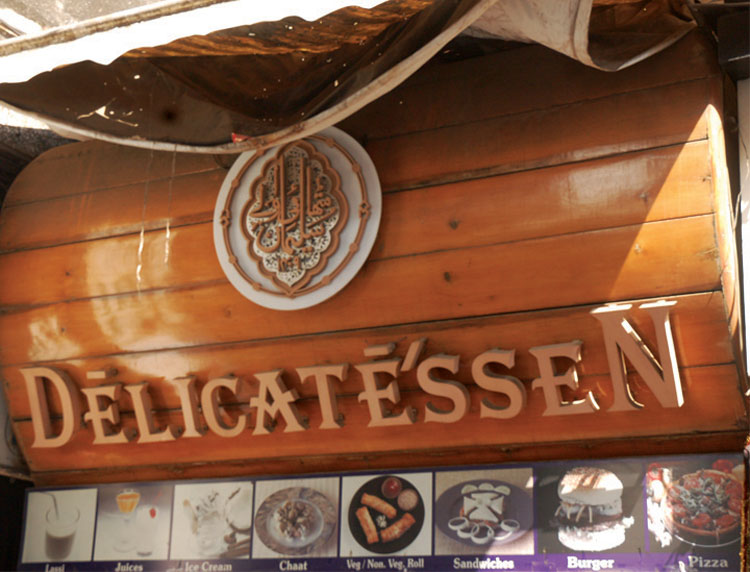
Use of typography as a graphic motif and the new panel form in wood makes the sign stand out amidst other restaurant signs.

The centrally aligned text with Arabic translation arranged as an emblem makes the identity unique.

The typography reflects subtle influence from Urdu letterforms and their subtle variance within the Latin structure.

Identity displayed bilingually in Primary colours against a white background reminds of the old hand painted signs of early 20th century.

The special characteristic being the presence of an oriental identity with script acting as image of the shop, more than just serving the lingual function of giving information.

Mohammad Ali road is a potpouri of flavours and fragrances. People from different cultures visit the place every day to rejuvenate their senses. The bazaar glorifies mix of shops selling oudh and perfumes, resturants, sweet shops etc. The street varieties of Kebabs, delicious curry dishes with rotis, new kinds of sweets, sherbats and lassi. The novelty of serving exclusive recipies goes to the extent of using Bollywood celebrity names for some of their dishes. Noor Mohammadi, regularly by film star Sanjay Dutt, has a chicken dish prepared as per his recipe — called ‘Sanju Baba’.
 

The big bold shop name in red, written in bold Urdu script catches eye. The style makes the otherwise modern display board visually enhanced.

Red, blue and green colours used in sequence to depict the bilingual name in varying typesizes makes the board a specimen of intense visual activity and rhythm.

The burned, rusted sign displaying Urdu letters of the name as a retro graphic pattern makes the identity of the shop unique.

The symmetrical façade of a mosque with the dome structure framing the board adds a deep cultural context to the sign design.

Two variations of Urdu script displayed in the name of the shop, along with a modern typeface called Stencil creates an interesting fusion of traditional with modern concepts of design.

Image of Sheep reminds of weaves and woven products. The expression establishes the impression about the products of the shop instantly.

Letterforms with round, delicate terminals reminding of tear drops. The typographic expression has an oriental feel to it.

Use of typography as a graphic motif and the new panel form in wood makes the sign stand out amidst other restaurant signs.

The centrally aligned text with Arabic translation arranged as an emblem makes the identity unique.

The typography reflects subtle influence from Urdu letterforms and their subtle variance within the Latin structure.

Identity displayed bilingually in Primary colours against a white background reminds of the old hand painted signs of early 20th century.

The special characteristic being the presence of an oriental identity with script acting as image of the shop, more than just serving the lingual function of giving information.


Creating Digital-learning Environment for Design


  • Courses
  • Resources
  • Case study
  • Showcase
  • Tools
  • Gallery
  • Videos
  • Animation Design
  • Communication Design
  • Design Fundamentals
  • Interaction Design
  • Product Design
  • Tools for Design
  • Open Design
  • Contribute to our Dsource
  • About
  • People
  • Events
  • Job@D'source
  • Contact Us
  • Privacy Policy
  • Download App
  • YouTube
  • Facebook
  • Twitter

Indian Language
English Bangali Gujarati Hindi
Kannada Malayalam Marathi Punjabi
Sindhi Tamil Telugu Urdu